Tuesday, December 10, 2013

Pantone's 2014 Colour of the Year: Radiant Orchid


Last week, Pantone announced 'Radiant Orchid' as the colour of the year for 2014.  Leatrice Eiseman, executive director of the Pantone Color Institute, says "It's a little different, it's a little off the beaten path, and it's not a primary colour," she explains. "It's an invitation to innovation. The purple family offers (an) opportunity to do creative things."  And, she said, that's what pop culture wants right now. "People associate purple with creativity and originality — and those are very valued today. We see words like that being used to describe technologies and products that are seen as innovative and with an approach you haven't tried before."

To be honest...I hate this colour!  It's not pink, it's not purple, I really don't know what to make of it.  It kind of reminds me of Pepto Bismol.  I know, a terrible thing to say but, that's why I write this blog.  The blogosphere seems to be abuzz over this colour...I just don't get it.

It's not a colour I would ever use on a wall as it would be very easy to get tired of.  Can you imagine standing in a room painted this colour?  It would make you look ill (a little harsh, I know). 

My overall impression...I like it as the colour for an orchid.  That's it!

Your thoughts?


Pinterest

Wednesday, November 27, 2013

No Going Back

Ever since we moved into our house, I have wanted to paint our fireplace white.  This dark, dull fireplace lacked visual interest and didn't really create the right focal point in the family room.  See below:


So, I finally got around to painting it (well, my Father did-but you get my point).  If you know me, you know I love white, light and airy.  This wasn't a really big deal for me, but for some I am probably committing the biggest crime against nature... painting over wood!  Even at the paint store, I was told "You can never go back once you paint wood."  I was not hesitant at all.  If it turned out nearly as good as some of these, I would be very happy.  How could you not love these?


Candice Olson


Sarah Richardson


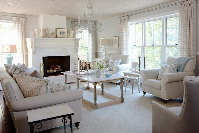
So, here is the finished project. I love the simplicity of the white.  It really has brightened up our family room and made it look so much more spacious. 


What do you think?

I want to thank the Hubs for having faith and letting me do this.  There's no going back and that's a good thing! Everyone is happy!  Check back soon as I will have photos of the mantel styled for Christmas! 

If you would like to fill your home with happiness, contact me for an online or in-person consultation.

Sunday, November 10, 2013

A Breath of Fresh Air - Benjamin Moore's Colour of 2014

Isn't it unbelievable that 2014 is nearly upon us?  And it's that time of year that paint companies come out with their trend colours for the upcoming year.  Benjamin Moore's 2014 colour of the year is "Breath of Fresh Air", a beautiful, ethereal blue, that's being called the "new neutral".  This colour is totally livable and functional with so many different styles.  Pastels are making a return to design, but not the pastels of the 80s, these are toned down with grey undertones.  Have a look:


Here are some colour schemes that can make 'Breath of Fresh Air' work in your living space:


You can see that 'Breath of Fresh Air' is such a versatile colour as it can be married with cooler tones as in the first combination and with warmer tones of the second, making it a great neutral.

Here's a fun, more playful combination that could work well in a boy's bedroom or playroom.


I was inspired to put together some items for your home that reflect the trend.

1 | 2 | 3 | 4 | 5 | 6 
 
 
I think 'Breath of Fresh Air' is the perfect light blue and its name says a lot.  More and more people are looking for their homes to be a refuge from the everyday chaos.  This colour reminds us to breathe, slow down and enjoy the comforts and simplicity of home. 
 
If you would like help incorporating this colour into your décor, contact me.


Sunday, November 3, 2013

Minto Dream Home

Anyone who knows me knows that I love to check out peoples' homes and how they live.  So, the opportunity to tour a dream home gets me very excited.  I recently toured the Minto Dream Home for the CHEO Dream of a Lifetime Lottery.  The house is over 5,500 square feet of pure luxury.  Check out some of the highlights:


Living Room: Right from the start this room set the tone for the rest of the house.  A very neutral, soothing scheme with pops of colour.  I noticed right away that the scale of furniture and decor pieces were oversized and made a statement...perfect for this house.  This house is huge so what goes in it needs to be as well!  I loved the natural, rustic look to the wood flooring and the organic feel that was created.

Dining Room: Here you can see what I was talking about about scale...huge chandelier, artwork, planter and centrepiece.


Study/Office: You will see here that the carpet on the floor is not an area rug, but it is actually carpet squares fitted together to make a rug.  I have considered using this in the past when I could not find a rug that worked perfectly in a space.  This option lets you customize your rug to the size and design you like. 

Family Room: I really liked the simplicity of this room and how it was injected with a little personality with the ottomans.  Love the coffered ceiling!!


Kitchen: It was nice to see a kitchen that was not too trendy...this one will stand the test of time.  Clean and simple!  You cannot see from the photo, but the kitchen was on the other side of the family room...a wall separated both rooms, which closed them off from each other.  In my opinion, I would have eliminated the wall opening both rooms up...it just felt a little closed off and small for this grand house.

 
Craft Room: I need one of these!  How much fun would this be?

Media Room: In the basement of the house.  This was a fun room with a small kitchen for entertaining.  Definitely a great man cave! 

Upper Foyer: I loved the double staircase and the feeling of grandeur created.  Also loved the oversized chandelier...a little quirky. You can see in the background a seating area with some interesting art on the wall.  It matched well with the cool vibe created in this area.


Upper foyer (continued): Although I liked the vignette created here, I felt like it didn't really work with the vibe in this area.  If you look at this photo and the one directly above, I don't think you would say that they are part of the same space.

Bedroom: When I first entered this space, I thought it was the master bedroom (except for the two beds).  This room was spacious and had a two-way fireplace that was open to the bathroom (see next photo below).


Bathroom: This bathroom convinced me further that this was the ensuite to the master.  Beautiful free-standing bathtub, double vanities, etc.  This room was HUGE!!!


Bedrooms: Two beautifully decorated bedrooms with lots of light.  You see the rugs created with various colours and patterns...love these!  Compared to the all the rooms of the house, these felt...dare I say, a little small.


Master Bedroom: I could really get a great shot of this room, but this room again, was amazing.  I loved the simplicity of the millwork around the fireplace.  This room is a great place to escape and relax!


Ensuite: I have to say the even though this is an amazing space, I liked the other bathroom a lot more.  This one just did not live up to the other one down the hall.  I know I may be a bit critical but, don't you agree?

Overall, this house is amazing.  What do you think?  I could definitely handle living here!  Thankfully, the winner of this house gets house cleaning for a year.  

If you want to see more, I've included the YouTube link to take a virtual tour.